
Thanks to those who participated in this poll. I had thought the voting would be closer, and planned to leave it running longer. However, a clear winner emerged with the people that voted over a three-day period ending Sunday 8 December 2013. Votes have shrunk to little more than one per day over the past two days. Because Fontforge is preparing a new release by the end of the year, I wanted to have a build in a steady state for them and so decided there wasn't any point in delaying a release longer. Here are the results:
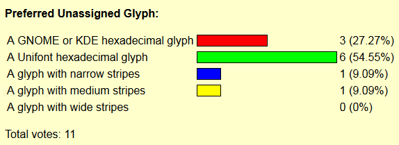
As you can see far more people wanted some type of hexadecimal glyph rather than the striped glyphs that appear in the Unicode Consortium's code charts. Of those who wanted some type of hexadecimal glyph, people preferred the white-on-black glyphs that are part of the current Unifont build rather than the glyphs that GNOME provides by a 2:1 ratio.
This also happens to be the default configuration of Unifont (though I didn't mention that earlier so as not to prejudice the voting results). So this also will simplify Unifont's font building and packaging, with one build configuration for all operating systems. That in turn will lead to a consistent user experience with Unifont on all platforms, which also has its merits.
I didn't think that the Unifont hexadecimal glyphs would be so preferred over the GNOME hexadecimal glyphs at first. Thinking about it, I can conjecture that reasons might have included:
Those might or might not have been the perceptual reasons for the Unifont hexadecimal glyphs being preferred over the GNOME hexadecimal glyphs. If those of you who voted for one version of hexadecimal glyph over another had another reason, I'd be interested in learning about it if it was more than an intuitive decision. Understanding this better would allow me to create better versions of Unifont in the future.
Finally for those of you who have read the page this far, here's how you can set up Fontforge to view the sample glyphs at their optimal size, which is 12 points:
Now open a font file. The Unifont sample glyphs will appear at 100% if you have unifont.ttf installed on your system. As a bitmapped font, the sample glyphs printed above each font glyph position will appear very sharp. Here's the result:
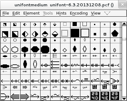
You might notice that the sample glyphs appear 2 pixels too high. That is a bug in the current version of Fontforge, and the Fontforge folks know about it.
I was not aware of this optimization when I posted sample images for the poll. Even without that setting, in spite of the Unifont sample glyphs being scaled down to a sub-optimal default of 10 points, 5 votes had been cast for Unifont hexadecimal glyphs after the first day of voting versus 2 votes for the GNOME hexadecimal glyphs. Unifont's hexadecimal glyphs were the clear winner from the start.
![]()
![]()